
What Are Hilbert Curves?
Every file in Stairwell has a picture of its bytes, drawn along a Hilbert curve. Learn to read it and you can spot packing, padding, and shared structure at a glance.
Every file in Stairwell has a picture. It sits beside the filename at the top of the object panel: a small square of colored texture that most people scroll straight past. It is a map of the file's own bytes, and once you can read it you can tell in about two seconds whether a file is packed, where its text and its padding sit, and whether two files are built the same way, without opening a disassembler.
What is a Hilbert curve?
A path that visits every cell in a square exactly once, without ever jumping across it. Start at one corner, follow the path, and you touch all of the square while every step stays next to the step before it.
That property is why it is worth drawing files this way. The obvious alternative, filling the square line by line like text on a page, breaks the file apart: two bytes that sit next to each other in the file can land at opposite ends of the image, one at the end of a row and one at the start of the next. A Hilbert curve keeps neighbors as neighbors. Bytes near each other in the file stay near each other in the picture, at every scale.
So a run of a few thousand identical bytes becomes a solid block your eye catches, rather than a thin line smeared across a raster scan. The boundary between two parts of a file becomes a visible edge. Structure in the file turns into structure in the image, which is what makes a file's layout something you can recognize instead of something you have to parse.
What do the colors mean?
Each pixel is colored by what kind of byte it represents.
| Bytes | Color | |
|---|---|---|
| ⬛ | 0x00, the null byte | Black |
| 🟩 | 0x01 to 0x1f, low bytes | Green |
| 🟦 | 0x20 to 0x7e, printable ASCII | Blue |
| 🟥 | 0x7f to 0xfe, high bytes | Red |
| ⬜ | 0xff | White |
Within the green, blue, and red bands, brightness rises with the byte's value, so the low end of a band is dark and the high end is close to full intensity. That is what gives the picture its texture: a region holding many different values in one band shimmers, and a region holding one repeated value is flat.
Here is the whole palette in one picture. This is a 256 byte file containing every byte value in order, from 0x00 to 0xff:
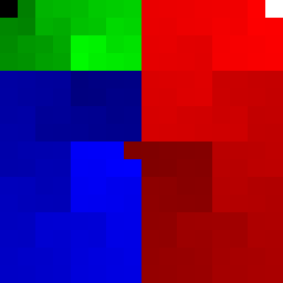
The single black square is 0x00, the single white square is 0xff, and each band darkens at its start and brightens toward its end. It is also a good picture of the curve itself: trace the path from the black corner through green, into blue, across to red, and out at white, and you have followed the file from its first byte to its last without the path ever jumping.
There is a sixth color, grey, and it is not a byte value at all. Grey is the absence of data: the curve ran out of file before it ran out of square. You see it at the tail of a file that does not fill the image.
What does an ordinary text file look like?
Mostly blue, with green flecks scattered through it. Here is a plain text file of a few hundred bytes:
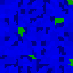
The blue is every letter, digit, space, and punctuation mark, because all of those live in printable ASCII, 0x20 to 0x7e.
The green marks are the line endings. A newline is byte 0x0a, which sits in the low-byte band that draws green, and it is the only non-printable byte most text files contain. So the green flecks are literally where the lines break. A file of short lines is speckled with green; a file of long paragraphs has far less of it.
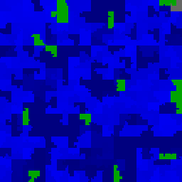
Once you know that, you can read a rough shape from the picture alone. This is what makes it worth learning: the same signature holds for every text format. Python:
And JSON:
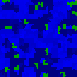
JavaScript, YAML, shell scripts, PowerShell, CSV, HTML, and configuration files all produce the same thing, because they are all printable ASCII separated by newlines. Blue with green flecks means "this is text", whatever the extension says it is. A file claiming to be an executable that draws like this is not one, and that mismatch is worth a moment of your attention.
The three pictures above are all a few hundred bytes. Small files fill the square because each byte is drawn as a block of pixels rather than a single dot, which is why you can see the individual newlines at all.
How do I tell a packed or encrypted file from an ordinary one?
Learn two shapes and the difference between them is obvious at a glance.
An ordinary program has parts
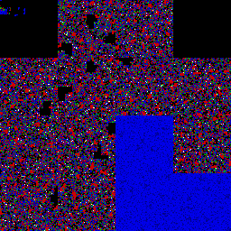
Textured, but organized. The speckled regions are compiled code, which uses many byte values without using them evenly. The solid black rectangles are padding between sections. The solid blue block is the string table, where the program's text lives. There are visible seams where one part of the file ends and the next begins.
Every one of those features exists because a compiler put it there on purpose, and that is what "structured" means when you are looking at a picture. You can see the file's parts.
Compressed or encrypted data has none
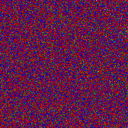
Even static, edge to edge, like an untuned television. All the colors mixed together at every brightness, no repeating motif, no seams, no blocks.
The reason is worth knowing rather than memorizing. Compression works by removing repetition, and encryption works by destroying pattern. Both leave data that uses the whole byte range evenly, and data that uses the whole byte range evenly has nothing for your eye to catch. The absence of structure is itself the signal. This is also what high entropy looks like, which is why the two sections belong together.
A program hiding something has both
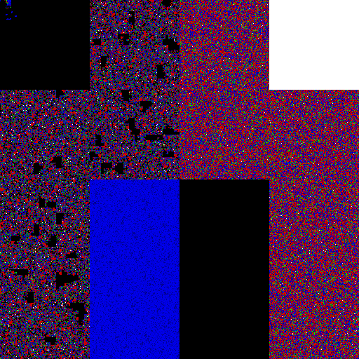
This is the shape to know. Structure on one side, static on the other, and a clean straight edge where they meet.
A program that is genuinely just a program looks like the first picture all the way through. When a structured region gives way to a large even block, something in that file is compressed or encrypted, and the edge is where it starts. In a stub that unpacks a payload at runtime, that block is the payload: it cannot be read as code by anything, including you, until the program decrypts it.
The edge is what makes it findable. Entropy averaged over this whole file would land in an unremarkable range, because the structured half drags it down. The picture shows you the seam anyway.
Packing is a reason to look closer, not a finding. Installers, archives, media files, games, and any application with compressed resources produce exactly this shape for entirely legitimate reasons, and a great deal of commercial software is packed to protect against copying. Nothing you see in a picture is a verdict on its own; the verdict is a separate question with a separate answer.
What the picture does buy you is a question worth asking: is this file the kind of thing that should have a hidden compartment? An installer, yes. A small utility that claims to do one simple job, no.
How does this relate to entropy?
The object panel reports a file's entropy, a single number for how disordered its bytes are. The picture and the number are answering the same question, and the difference between them is the reason to learn the picture.
Entropy runs from 0 to 8. Zero means every byte in the file is identical. Eight means the bytes are indistinguishable from random. In practice:
| Entropy | Usually means |
|---|---|
| Under 1 | Long runs of one value. Padding, sparse regions, erased flash |
| 3.5 to 5 | Ordinary English text, source code, configuration |
| 5 to 7 | A typical compiled binary, code and strings and tables mixed |
| Over 7.5 | Compressed or encrypted, or an installer that contains such data |
Do not use entropy as a malware signal. This is the trap, and it catches people who learned the number before they learned the picture. Real malware is routinely low entropy: samples from Operation Aurora, Stuxnet, Conti, Darkside and Triton sit between 4.3 and 6.5, which is squarely ordinary. Meanwhile a perfectly legitimate software installer reaches 7.97, higher than almost any of them, because it is full of compressed payload. High entropy is a property of packing, and packing is used by everyone.
What the picture gives you that the number cannot is where the disorder is. Entropy averages the whole file into one figure, so a small encrypted blob bolted onto a large ordinary program barely moves it. In the picture that blob is a visible patch of static with a clean edge against structured neighbors, and the edge is the finding. A file that is uniformly disordered and a file that is ordinary with one disordered region can report the same entropy and look nothing alike.
So read them together. The number tells you the file's overall character in one glance, and the picture tells you whether that character is uniform or hiding a seam.
Why do two files with the same name look different?
Because the picture describes the bytes and the name describes nothing.
This is the most useful habit the binary image buys you. Put a set of files that claim to be the same thing side by side, and the one that does not belong announces itself before you have read a single hash. A row of copies of a common Windows utility will share a layout, because they are builds of the same program. One that carries a different arrangement, an unexpected blue region, or a large block of static where the others have structure, is not that program, whatever it is called and whatever extension it carries.
The counterfeit is often larger than the real thing, too, since a payload has to live somewhere.
Stairwell leans on this in grid views, where each result is drawn as its own picture, and in the Variants list, where every candidate is drawn next to the file you started from. Filenames are deliberately not treated as indicators anywhere in the platform, for exactly this reason: a filename is the one property an attacker picks freely, and it is the one property that costs them nothing to make convincing. The picture is not free to fake, because it is the file.
What else can I see in the picture?
- Padding and alignment. Large solid black areas are runs of null bytes: zeroed space, alignment padding, or a sparse region. Large solid white areas are runs of
0xff, common in firmware images and erased flash. - Text, config, and scripts. Blue regions are printable ASCII. That is where string tables, embedded configuration, scripts, certificates, and XML manifests live. A file that is blue almost everywhere is a script or a text format rather than a binary.
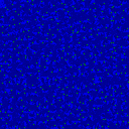
- Fixed-size records. Regular stripes or a repeating grid at an even interval mean an array of same-sized structures, such as an import table, a relocation table, or an exported data file with one row per line.
- Something appended. A picture that looks normal and then changes character partway through, with a clean boundary, is usually a file with data added after the fact.
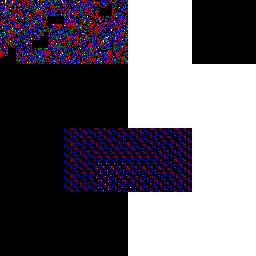
Two of those are worth seeing. Fixed-size records, where every row is the same width and the regularity becomes a visible rhythm:
And a firmware image, where the large white areas are runs of 0xff, which is what erased flash memory reads as before anything is written to it:
How do I use it to compare two files?
Put the pictures next to each other and look for the same arrangement in the same places. Two builds of the same program keep their overall layout: the same block order, the same proportions, the text region in the same part of the square. A file that has been recompiled changes in detail everywhere while keeping that arrangement. A file that has had a payload added keeps the original arrangement and gains a new block.
Stairwell already lays this out for you. Each row of the Variants list draws that file's own picture next to the picture of the file you started from, so running your eye down the column compares a dozen candidates structurally in one pass. Use it as a fast reader on top of the ranked list: it is how you decide which two or three variants to open first, not a measure of how related they are.
Where do I see it in Stairwell?
- The object panel header, next to the filename and hash. See The Object Panel.
- The Variants list and its lineage view, one picture per related file.
- Object cards in list views, where the picture rides along with the hash and verdict.
- Full size in its own browser tab. Hover the picture and click the magnifier to open the image by itself, which is the only way to see it at real resolution.
Is there a palette for color vision deficiency?
Yes, and it is worth knowing about because green against red is the worst possible pairing for the most common form of color vision deficiency. Stairwell can draw the same picture with a second palette built for deuteranopia: low bytes become an olive brown instead of green, high bytes become a magenta instead of red, and the printable ASCII blue is left exactly as it is. Black, white, and grey do not change, and nothing else about the drawing changes, so a picture in this palette can be compared with one in the standard palette.
To use it, open the full-size image in its own tab as above and add ?cd=1 to the end of the URL, so the address ends /hilbert/<sha256>?cd=1. The same URL takes ?v=1, which draws the file as a tall narrow strip instead of a square. The strip covers more of a large file, so it is the better view when the square has clearly run out of room.
What are the limits of this?
Three, and all three matter when you are comparing files.
The square is drawn from the first 4 MB of a file. A larger file shows its beginning, not its whole self, so the absence of something in the picture is not evidence that the file lacks it.
A file much smaller than the square is stretched, with each byte covering several pixels, so that it still fills the frame. That means the apparent size of a feature is not comparable between files of very different sizes. Compare arrangement, not scale.
And the picture is a reading aid. It is a fast way to form a question about a file. It is never the answer, and it does not replace prevalence, the verdict, or your own judgment.
What should I read next?
- The Object Panel, for the rest of what that screen is telling you.
- Variants, where these pictures are most useful, side by side.
- Objects, if you want the vocabulary behind what a file is in Stairwell.
Updated about 1 month ago